Friday, July 18, 2014
Wednesday, November 27, 2013
pattern
i’ve been rethinking ideas about composition since seeing Dan Coles work. he has a refreshing point of view. he searches for patterns like no other. in a way he breaks a lot of the conventional “rules” of image making but he does it SO well that it makes you see the world differently, which is always the goal of art isn’t it? so when i came across this boat (in Glendale!!!) i purposely looked for the pattern of the scene and not the deep space or dimensionality of it.
Sunday, October 27, 2013
Glendale Tonality
you know what i said last week about designing your color schemes? about being intentful and having an idea behind it? well, i was in such a hurry to capture the tonality of this scene (the way the bushes visually grouped, observed by squinting) that i quickly blocked in my flat colors without getting a good design to them. this really came back to bite me in the rear because those first colors and tones set up the rest of the image, you can’t really re jigger them, you can’t really bring design to where is none. so, while this has a nice tonality about it those first large color notes should have been better designed out….
Sunday, October 13, 2013
Monday, April 15, 2013
Monday, April 08, 2013
Monday, April 01, 2013
Thursday, February 28, 2013
Wednesday, November 21, 2012
Thursday, August 09, 2012
Friday, July 27, 2012
Monday, June 18, 2012
Friday, June 08, 2012
TRON:UPRISING
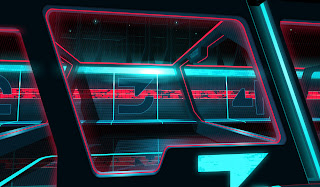
Tron Uprising aired last night and i'm glad to be able to share some of the designs i did for the show. i can only share what's been shown so far but what a bold look Alberto and Charlie are pushing! more to come!
Labels: background, concept art, tron, uprising
Friday, March 02, 2012
Tuesday, February 21, 2012
Friday, January 06, 2012
Graphic Glendale

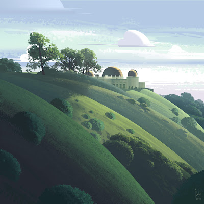
the latest in the series. still working on doing more with less. meaning, what are the absolute essentials of the scene and still have it represent what's there in front of me. trying to spend more time understanding what's going on and less wrist movement. art is always a translation of reality, always
Friday, December 30, 2011
Tuesday, December 20, 2011
Tuesday, December 13, 2011
Valley View

or near that street anyway. every single shape is altered, pushed and skewed in this one even though it looks somewhat real. had an interesting talk with Robert Valley which lead to this. although my stuff isn't nearly as pushed as his. i really exaggerated the rhythms of the trees, bushes and lawns as well, pushing and distorting them quite a bit while keeping the values and colors on the very real side. the shapes are very simplified and designed. the atmospheric perspective is exaggerated too to enhance the depth of the street. in reality its not nearly as strong.
Thursday, December 01, 2011
FALL IN LA

granted it's not as picturesque as Vermont but LA ha it's own unique palate. concrete and orange. lately i've been thinking a lot more about designed shapes versus sight to size/visual impression. this may seem very "real" looking but i changed/altered ever shape in here. i kept the color and tonality true to nature but really pushed the shapes, even though they may have a realistic feel.
Labels: digital plein aire, plein aire
Tuesday, November 29, 2011
More UNCHARTED 3


here's a few more concept deigns from Uncharted 3. i was trying out a little more of my graphic look on these.
Labels: concept art, concept design, uncharted 3
Tuesday, November 22, 2011
Tuesday, November 15, 2011
UNCHARTED 3


enough time has passed i thought i'd post a few of the concept designs i did for U3! i waited a beat because i didn't want to give anything away for the hardcore gamers who played to the end already. and thanks to the fans of the series for the awesome sales so far!!!
Labels: concept art, uncharted 3
Thursday, November 10, 2011
Graphic...Altoona?


I was in Altoona,PA for Illuxcon last week (thanks again Pat and Jeannie for putting on a great show) and I was exposed to an entirely different set of shapes and lighting conditions. I carried a small sketchbook with me and tried reducing the scenes in front of me to just black or white before working out the actual shapes. i'm still using super simple shapes (line tool, square brush, square marquee) to block out the piece. Keeping to a strong, simple, stark, graphic composition makes for a better image i'm rediscovering. Here's the latest in the series of, but no longer strictly Graphic LA.


